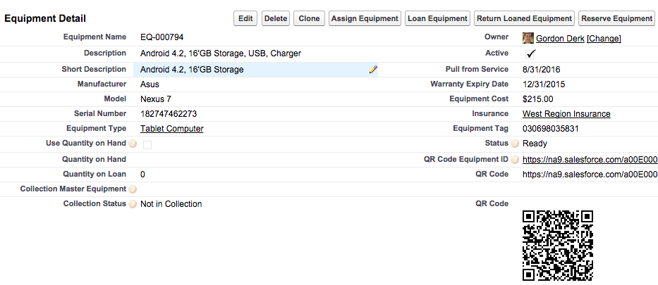
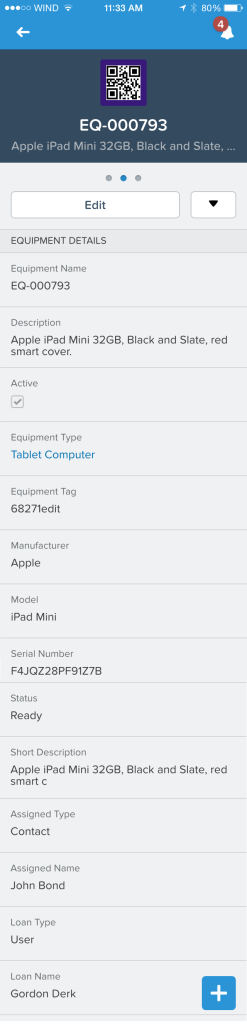
 After discussions with a couple of my clients this week, I have decided to wade into the debate. Mobile First, Mobile Only or Mobile Also. For my product and my clients needs, I am firmly in the Mobile Also camp. I hear and understand the discussions about Mobile First and Mobile Only. I appreciate and agree that a great mobile UX is critical (who wants a document on how to run a mobile app). But lets look at what mobile users are actually doing vs. their counterparts running on a web browser with a large screen. Just the number of fields that can be displayed allow a web browser on a computer to offer a single screen view of a lot of data. Mobile users should have their experience optimized to present them with the top 8-12 fields that they may actually need to minimize scrolling and tapping. In a Mobile Also world, mobile users get the data they need with consideration for the screen size. Web browser users on a computer can display lots of data all at once without scrolling. So they require different design and layout considerations. Take my two screen shots as an example. The basic details from a web browser vs. the scroll to view format of a mobile device. Lots of the data is the same, but considering the layout and use case allows user to be effective in either format.
For our products (and I expect for all business apps) it is really about focusing on the use case. what is the mobile user going to actually do on their mobile device vs. a user with a web browser on a large screen. Stay focused on use cases and your mobile user will ALSO be happy users.